
Advanced Chart in Tableau
There are innumerable creative ways to visualize your data in Tableau. While bar graphs and pie charts have their uses, an advanced chart can sometimes be the best way to present the most vital information. In this blog, we explain five advanced chart types in Tableau that will help you bring your data to life.
Tableau is an effective Business Intelligence tool, so it includes a variety of visualizations to represent various business scenarios. It also includes the VIZQL (Visualization Query Language), which allows you to execute queries and communicate with the SQL database. Tableau offers over 25 different types of visualizations, including charts, maps, and graphs. Tableau has everything from a simple bar chart to advanced stacked bar and gauge charts.
We cover the following advanced charts of Tableau in this blog.
- Area Chart
- Stacked Bar Chart
- Bullet Chart
- Spark Lines
- Bar-In-Bar Chart
- Box Plot
- Pareto Chart
-
Area Chart in Tableau
An Area Chart is a type of graph that depicts the relationship between various data variables. It compares the cumulative area of each portion to the total sum of the percentages. Depending on the type of values it represents, an area chart can be either continuous or discrete. The following are the essential steps for creating an Area Chart in tab tableau:
-
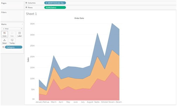
- Drag the Order Date column measure to the Column section and select months from the drop-down menu.
- In the row section, add Sales and convert the resulting figure to an Area Chart from the Marks section.
- Now, in the Color marks section, add Category, and your chart will be divided into multiple sections based on the area required by each category.
-
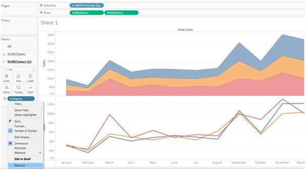
- The Sales measures to be dragged once more to the row section. This will result in the exact configuration of two area charts.
- Then, change the second area chart from the SUM(Sales) 2 section to a line graph and take the Category dimension out.
-
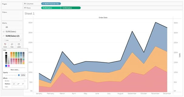
- Then, choose the Dual Axis option from the dropdown menu in the second Sales row.
- Finally, alter the outer line’s color or size, and your area chart will be ready for use.
-
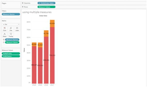
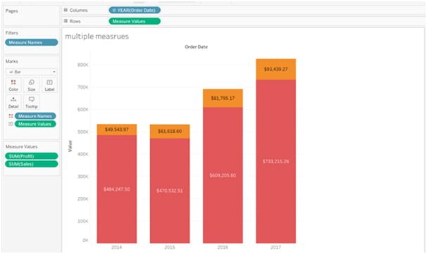
Stacked Bar Chart in Tableau
A modified version of a simple bar chart is termed a stacked bar chart that has additional segments added to each bar. Each segment displays the measured value in various tints of the same color. These segments can be made using a variety of measure values, including Profit, Category, and more. You can use multiple measures to create a tableau stacked bar chart by following the steps below:
-
- Take the Sample Superstore dataset of Tableau Desktop by proceeding to your device’s storage. Go to the worksheet after establishing the relationship between the tables.
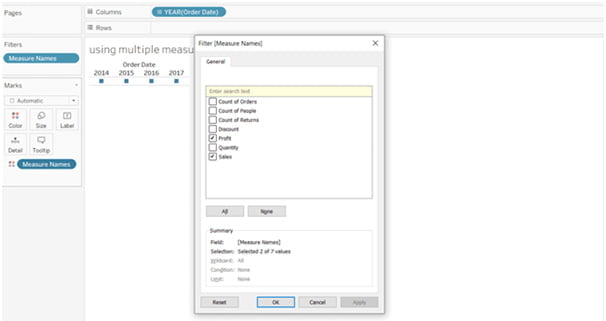
- Drag Measure Names to the Color marks section and Order Date to the Column from the Data panel.
- Use the Measure Names dropdown menu’s filter options, choose only the Profit and sales measure, and then press the Apply button.
-
- Drop the Measure Names into the Rows section after that, and a line graph will show up on the screen. From the Marks section, you can change it to a bar chart as shown below:
-
- You can add data fields or change various settings to make the Stacked bar chart more interactive.
- Now, while holding down the Ctrl key, switch the Measure Names from Details to Colors in the marks section and move the Measure Values from Rows to the label marks section.
- Your Stacked bar chart is now prepared to be added to the dashboard; simply alter the segment colors and bar chart size.
-
Bullet Charts in Tableau
The tableau bullet chart is yet another sophisticated way to compare two or more data fields on a single bar. For datasets where you must compare the actual result with the expected result, bullet charts are appropriate. To compare the sales made this year to the sales made last year and the annual target, for instance, you could make a bullet chart. Now, let’s create a sales bullet chart with the steps below:
-
- Load your Sample Superstore dataset into a new workbook or worksheet in Tableau Desktop.
- Sub-category in the Row section and Drop Profit and Sales measure in the Column section.
- From the Show Me panel, choose Bullet graphs as your visualization.
- The expected value will be represented by a small segment in a bullet chart with blue bars acting as the actual bars, and grey as the reference lines.
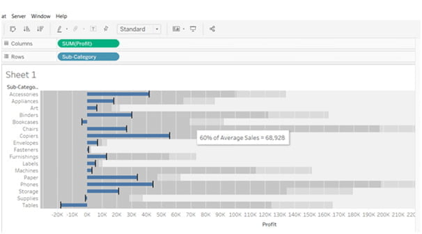
- To align your chart with the needs of your business, change the view, add distribution using the Edit Reference Line, and add features like Average Sales.
-
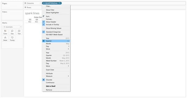
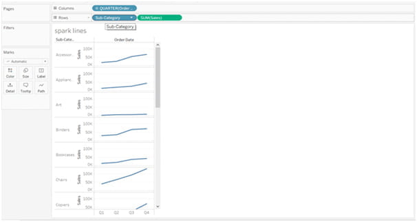
Spark Lines in Tableau
The compressed graphs or charts used in the tableau to display the trends across different measures are called Spark Lines. Sparklines were first used in corporate dashboards by data visualization expert Edward Tufte to quickly display trends across KPIs. You can make a sparkline by using the instructions below:
-
- The measure Order Date should be added to the Column section of a new worksheet.
- Now, as shown in the illustration below, open the Order Date dropdown menu and select Quarterly:
-
- Drop the Sales metrics and the Sub-Category to the Row section after that.
-
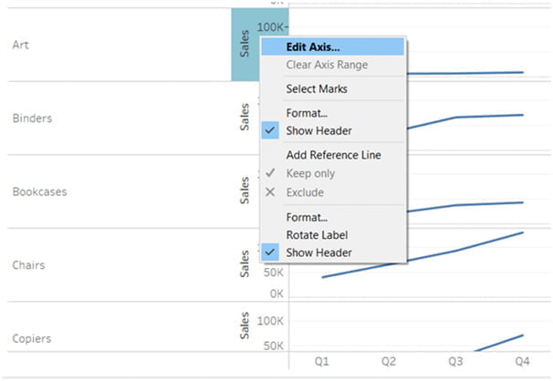
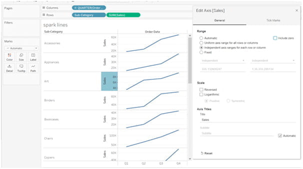
- Select Edit Axis by performing a right-click on the visualization’s Sales section. You must set the Range of your Sparkline axis to be Independent of each row or column and exclude all Zeros in the dialogue box that will appear.
-
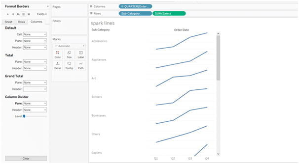
- Once finished, hide the Sales header and close the Edit Axis dialogue box.
-
Bar-In-Bar Chart in Tableau
One of the most widely used advanced charts in a tableau used by data scientists to compare one another is the bar-in-bar chart. Based on the measurements found in the rows and columns section, it is made up of two bar charts that are interlocked with one another. You only need to adhere to the few steps listed below to create an interactive Bar-In-Bar chart:
-
- Drop the Profit and Sales measures into the Column and Row sections of the new worksheet. Additionally, add State measures to the section for detail marks.
- Now click on the Side-by-Side bars icon in the Show Me panel on the right side of the interface.
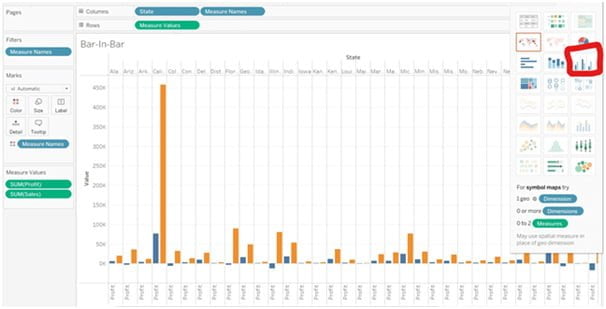
-
- Drop the Measure Names from the columns section to the Size marks section once your chart has been converted.
- Turn off the Stack Marks option and select Analysis from the toolbar up top.
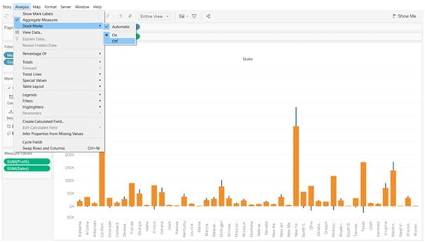
-
- The Measure Names will now appear at the bottom of the bar chart rather than at the top thanks to the previous step.
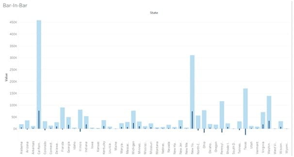
- Finally, switch your chart’s view to “Entire View” and modify the bar colors in the “Color marks” section.

-
Box Plot in Tableau
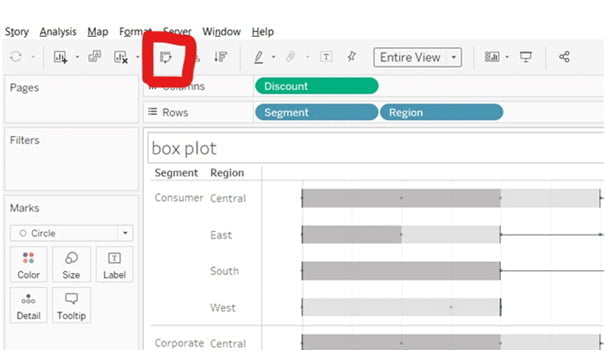
The graph also referred to as the Box-and-Whisker Plot, displays how different data values are distributed along the axis. With a measure in the Columns shelf and a dimension in the Rows shelf, the distribution is shown in the granular format. By using the steps listed below, you can make a straightforward Box Plot in the tableau:
-
- Drag the measure to the Columns section of Tableau Desktop after connecting the sample data source. Drag the Discount measure to Rows in a similar manner.
- The interface will display a vertical bar.
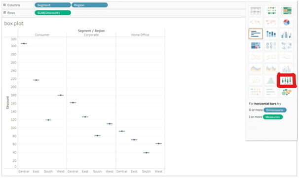
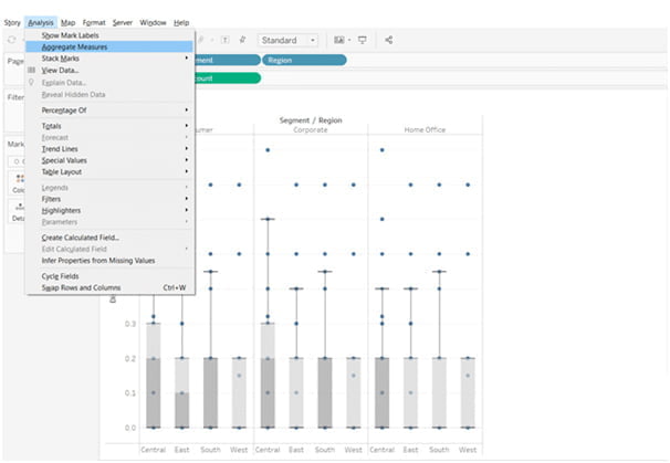
- Add the Region dimension now to the Column section, to the right of the Segment.
- Drag the Region dimension from the marks to the right of the Segment in the column section after selecting the Box-and-whisker plot from the Show Me panel.
-
- Select the Aggregate Measures option under the Analysis section.
-
- Utilize the Swap button located just below the Server toolbar to change the chart’s axis.
-
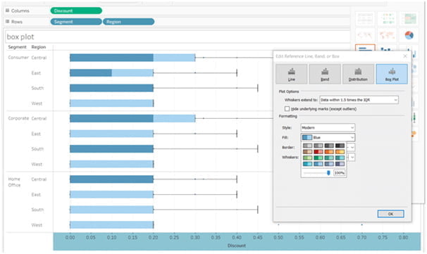
- Then, choose Edit Reference Line from the context menu when you right-click on the X-axis and modify the color of your Tableau Box Plot chart.
-
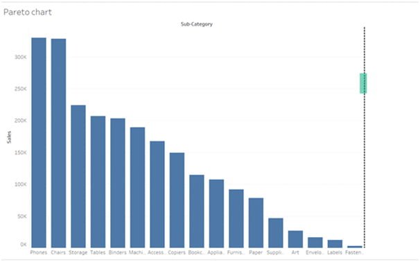
Pareto Chart in Tableau
It is a type of chart that combines a line graph and a bar chart, and it is named after Vilfredo Pareto. Here, a line graph shows the cumulative total, and a bar chart in descending order shows the other data values. The Pareto principle, also known as the 80/20 rule, was created in 1906 and is used to evaluate the effectiveness of your business plans. An instruction manual for making a Pareto chart in Tableau is provided below:
-
- Open Tableau Desktop and load Sample Superstore or any other dataset.
- The Columns and Rows sections should now include the Sub-Category and Sales dimensions from the Data panels.
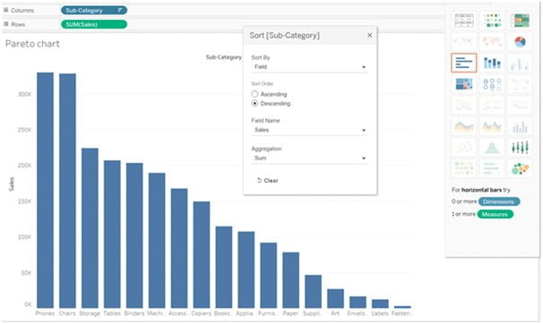
- From the Sub-Category column’s drop-down menu, choose the sort option.
- You must choose Descending as the sort order in a dialogue box that will appear, as shown in the screenshot below.
-
- Once a dotted line appears, drag the Sales dimension to the interface’s right side.
-
- A line will appear on your bar chart when you drop the Sales dimension there by itself.
- Go to the second Sales row’s drop-down menu and choose Add Table Calculation.
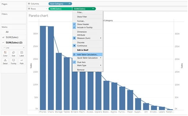
-
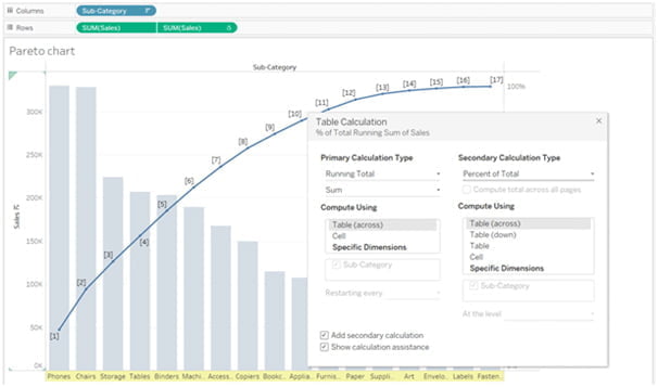
- There will be a dialogue box with various options for table calculations.
- Choose Running Total as the primary calculation type, then select the checkbox next to Add secondary calculation.
- A Pareto line will now show up on the chart when you choose percent of Total as the secondary calculation type.
-
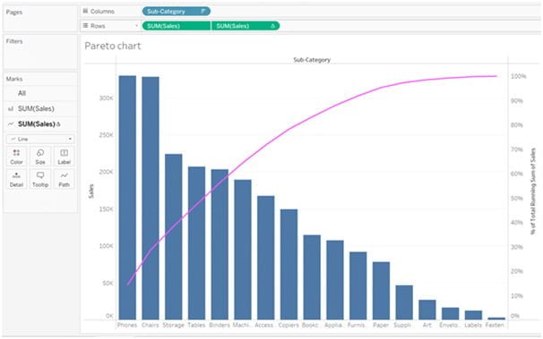
- Finally, modify the line’s color, size, and other characteristics, and your Pareto chart will be prepared for use in the Tableau dashboard.
Conclusion
Hopefully, you now have the confidence to use these advanced chart types to energize your dashboards. Enroll in Softlogic Systems‘ Tableau Training Institute in Chennai to discover how to create advanced charts in Tableau.