
All you need to know Power BI Visuals
Your Power BI report is meaningless without the appropriate visuals. You may present smart data effectively and save time on the preparation of ineffective reports by knowing when and how to use different visualizations. You will discover in this article not only the fundamentals of using common Power BI visualizations but also specifics regarding their size, use in a layout, use cases, and examples.
We’ll also go over how we choose which visuals to employ to highlight certain insights. Gain expertise in complete power bi visuals in our Power BI Training Institute in Chennai with Placement Assistance.
What is Power BI Visuals?
Visuals are essentially a visual (picture) representation of your data and are in charge of giving it life. They are the most important part of any Power BI report. Making your data story more visually appealing will help your audience more easily identify and understand the trends in your data.
Types of Power BI Visuals
There are many different methods to see your data in visual. You should think about the kind of information your insight wants to offer when selecting your graphic. The data you wish to transmit and what you want to say about that data will determine the type of image you select.
The following 6 categories can be used to categorize Power BI graphics in general.
- Comparison Visual
- Data Over Time Visual
- Correlation Visual
- Distribution Visual
- Part-to-whole Visual
- Ranking Visual
Comparison Visual
Comparison Visuals compare data across many categories.
Application: Revenue over multiple fiscal years.
Following are lies under comparison visuals
-
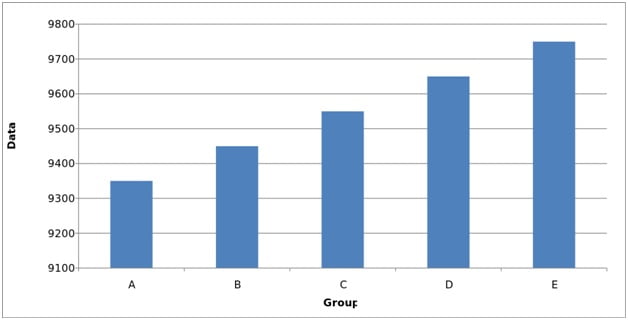
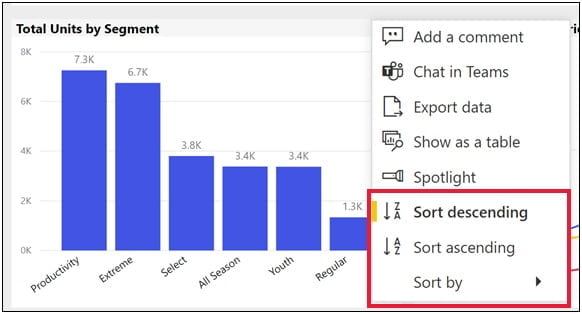
Bar Chart in Power BI
The bar/column chart is one of the most widely used types of visual since it is simple to scan and rapidly locate information. The bar/column chart is used to compare several things within a given range of values. The length of each bar/column is proportionate to the value it represents. Using a column chart, for instance, to display monthly sales performance over the course of the fiscal year.
-
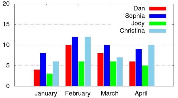
Grouped Bar in Power BI
In addition to a bar chart is a clustered bar/column chart. The graphic compares and illustrates many different categories as opposed to just one. Because the categories are presented and grouped side by side, it is simple for the user to understand the distinctions between each group as well as similarities between groups that share the same category.
-
Line Chart in Power BI
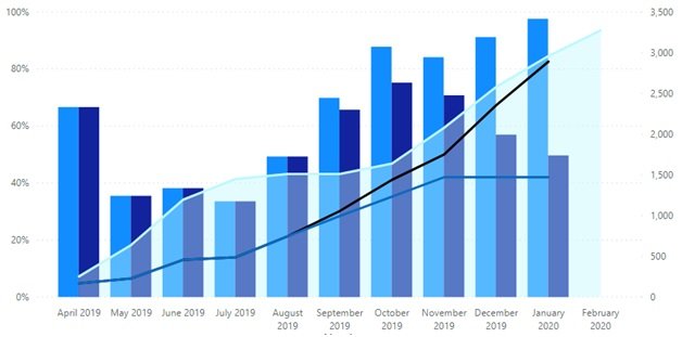
The line chart is a straightforward diagram that displays changes over time by utilizing dots that represent the data points and a straight line to connect them. Using a line chart, for instance, to display the monthly revenue for the fiscal year
-
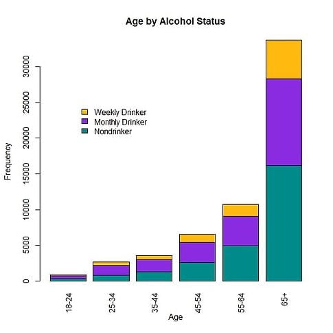
Stacked Bar in Power BI
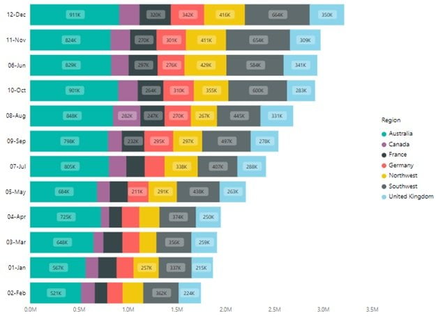
The basic bar chart can be extended to display comparisons between data categories and the ability to break down and analyze individual components. This is known as a stacked bar/column chart. Each bar is a whole that is divided into segments to reflect its various categories.
-
Ribbon Chart in Power BI
A ribbon chart resembles a stacked column chart, except the categories are arranged differently on each stack. Users may easily determine which data category has the greatest rank by using this style of display.
-
Shape Map in Power BI
A shape map is a visual representation of how regions on a map are compared to one another using a single variable and a color scale. Users may easily determine which locations are working well and which are not by using this type of display.
-
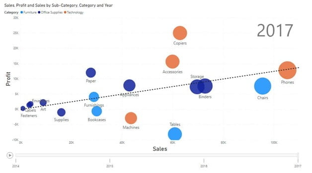
Bubble Chart in Power BI
The association between three separate factors is examined using a bubble chart. The Power BI scatter chart is modified to produce the bubble chart.
The vertical/horizontal location and size of each dot (bubble), which corresponds to a single data point, represent the values of the variables for that point.
-
Area Chart in Power BI
Similar to a line chart, an area chart uses color-filled spaces between the axis and the line to represent the volume of values while displaying the magnitude of change between two or more data points.
Area charts are a wonderful way to display the magnitude of a trend over time, such as monthly sales income.
-
Donut in Power BI
Using a donut chart, which uses the size of each component to reflect the percentage of each category, it is possible to visualize how different values contribute to the overall value.
Donut charts are most effective when used to visualize data division, such as when dividing orders amongst different product categories. The donut offers a visual depiction of this divide in addition to supporting information like extra values and percentages.
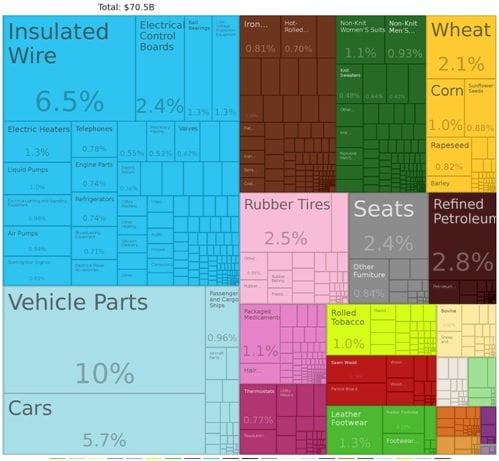
Treemap in Power BI
Large amounts of hierarchically structured data are displayed using layered rectangles in a treemap. By showing the rectangles in varied sizes and colors, this sort of chart enables you to demonstrate various angles of the data.
Data Over Time Visual in Power BI
Data over time visualizations show how data has changed over time and are used to spot trends or changes.
Application: Changing sales results.
Bar Chart, Area Chart, Line Chart, Bubble Chart, and Stacked Bar are the same as Comparison Visuals in Power BI. Stacked area and Waterfall are new in Data Over Time Visuals in Power BI.
-
Stacked Area in Power BI
A stacked area chart is a development of the basic area chart that shows the change in values for various categories. The data for each category are displayed on top of one another, allowing the user to see the total for the category and the weight of the group.
-
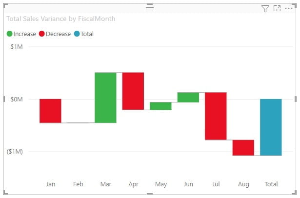
Waterfall Visuals in Power BI
The user can better grasp the cumulative effect by using a waterfall chart. It is frequently used to demonstrate to consumers how an initial value changes or rises over time based on a succession of values that result in a final value. A waterfall chart’s values might be either positive or negative.
Correlation Visual in Power BI
<span style=”font-weight: 400;”>To determine whether two or more variables are related, correlation visualizations are employed.
Application: Demand and price
A bubble chart is one type the same as the other two chart types. Column Lines and Scatter Plot are the new types of charts in Correlation Visuals in Power BI
-
Column Line in Power BI
On this graph, a column chart and a line chart are combined. With each variable having its own y-axis, the chart will show one variable as a line chart and the other as a column chart.
-
Scatterplot Visual in Power BI
The association between two different variables, each displayed on a separate axis, is visualized using dots in a scatter chart. The best way to examine correlations in your data is through scatter charts. The dots are correlated if they fall along a curve or a line; the stronger the correlation, the closer the dots will be to the line. Using a scatter chart, for instance, to display the state-by-state link between sales and quantity
Distribution Visuals in Power BI
To display the frequency of values in a dataset, distribution visualizations are utilized.
Application: Order distribution.
Bubbled Charts and Grouped Bar are the two types of visuals in this category.
Part-to-Whole
Part-to-whole diagrams display the division of components that make up a whole.
Application: Profit by product segment
Donut Charts, Stacked Bar, and Treemap are the types of charts in the Part-to-whole category.
Ranking Visuals in Power BI
When the element’s position overrides its relative value, ranking visualizations with an ordered list based on a single data point are employed.
Application: Leads by sales stage
The ribbon chart is the same as other categories. Ordered columns, ordered bars, funnel, and decomposition trees are other types of Ranking Visuals in Power BI
- Ordered Column
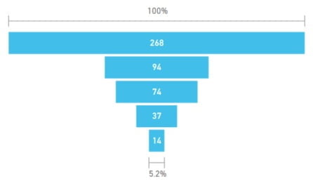
- Funnel Chart in Power BI
To depict a linear process with connected sequential stages, a funnel chart is utilized. The funnel’s width, which decreases as the process progresses, represents the importance of each stage. This kind of diagram can be used to point up process-related issues inside an organization. For instance, sales process stages are frequently represented by funnel charts.
- Ordered Bar Visual in Power BI
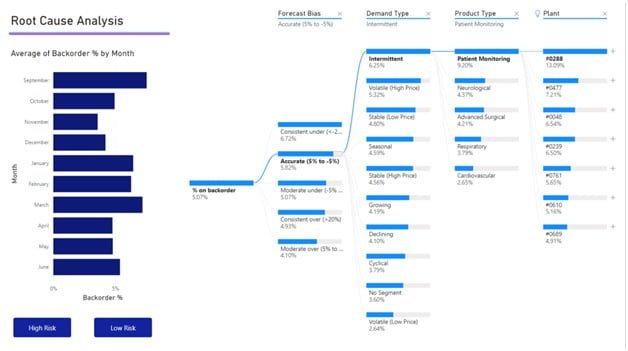
- Decomp. Tree in Power BI
A decomposition tree aggregates data from various dimensions, visualizes it and allows you to drill down into any combination of your dimensions.
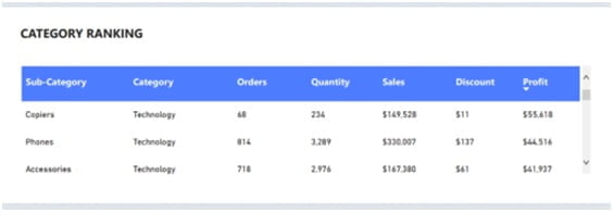
Table
Quantitative comparisons are made using tables, which allow you to view and contrast precise values and specific data.
Using a table to compare sales between this year and last year, for instance, using conditional formatting to determine whether there were rises or drops in sales
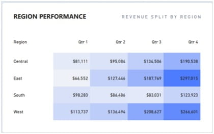
Matrix
A matrix functions very similarly to a pivot table and is similar to table. When cross-highlighting one field of data with another to calculate totals and subtotals, the matrix visual can be a useful tool. Using the matrix, for instance, to cross-highlight sales by location and quarter
Card
The simplest Power BI graphic is a card, which merely displays one number. The number you select to depict in this visual should be significant, such as the number of closed businesses or the number of opportunities in the pipeline.

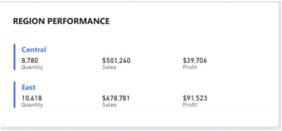
Multi-Row Card
A multi-row card expands upon the basic card visually and enables the concatenation of multiple single cards into a single visual. The multi-row card, like the card, works well when representing a variety of KPIs or high-level indicators.
For instance, you might use a neat and condensed structure to show the name of the category and its related value while also highlighting the overall sales for each product category.
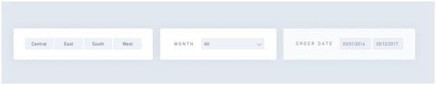
Slicer
A slicer is a visual filter that lets you select the data type and automatically filter the report’s visuals based on that selection.
Quick snapshots of data pertaining to a certain field can be taken with the help of filters. For instance, a line chart with a year filter would enable users to swiftly switch between various time stamps of their data.
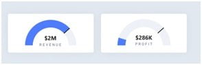
Gauge
A gauge is a circular arc that displays a single figure that indicates how far you have come toward a KPI or objective. The target or goal is shown by the line on the arc, and the amount of shade indicates how far we’ve come. The progress value is displayed by the value inside the arc. For instance, to demonstrate how your team is doing in relation to your revenue target.
Positioning of Visuals in Power BI
It’s important to consider where you place your visuals in your report.
Your viewers will understand and integrate the information more quickly if you use a consistent structure and group pertinent metrics together. Users tend to digest information from top to bottom, so having the right layout means that your dashboard is simple to grasp and has a natural flow between various insights.
The easy interpretation of user insights is further improved by grouping pertinent metrics, such as KPIs, together.
We can start segmenting our dashboard by using the dashboard example below to make sure the right layout is used.
Here is the Power BI Grid that helps professionals with positioning visuals
It’s recommended practice to adhere to the following advice when choosing where to place each of your visuals:
Top
As seen by the red part in the canvas grid above, the top of a dashboard should contain high-level insights that are visualized as visuals, such as KPIs or Gauges, and is best confined to 2-3 squares.
Middle
Trend-based data, particularly activity-based metrics, and visualizations that show data over time, should be displayed in the center of a dashboard. The purple portion in the canvas grid above serves as an example of how this section works well for larger pictures and is best maintained to 4-6 squares.
Bottom
As shown by the blue region in the canvas grid above, the bottom of a dashboard is designated for granular data like certain KPIs, or Tables, and is ideally confined to 3–4 squares.
Sizing of Visuals
Your images’ size will depend on how much detail you wish to show in them. You want your image to be larger the more information your insight provides so that consumers can discern the finer aspects. As opposed to an insight that only visualizes a single statistic, you could choose to use a broader visual when visualizing an insight that compares numerous data categories.
- For small-scale visuals, Card, KPI, Filter, Gauge, and Donut types are suitable
- For large-scale visuals, Bar charts, Scatterplot, Area Charts, Treemaps, Maps, Tables, Donuts, Ribbon, Matrix, Line Columns, Waterfall, and Funnel types are suitable
Tips to use Visuals in Power BI
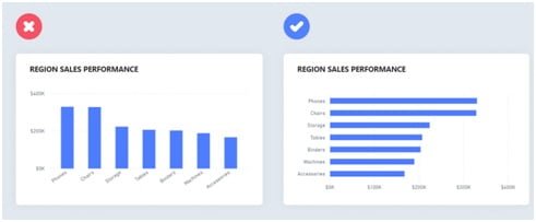
- Avoid Slanted Labels: Information might be misunderstood by readers when writing is slanted. Use a bar/column version of your graphic alternately to present text in a comprehensible manner.
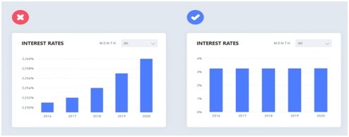
- Include a Zero Baseline: Small variations in data can appear misleading in the absence of a firm baseline. Add a zero baseline when appropriate to provide comparisons of insights and greater context.
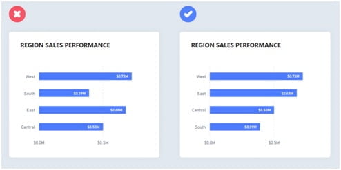
- Order your data: As unordered images add needless complication, arrange them to help readers understand the hierarchy of the facts.
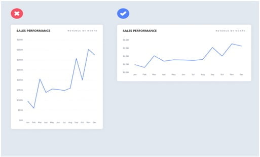
- Use Suitable Proportions: Avoid overstretching and projecting graphs at an angle of more than 45 degrees to avoid warping the graphics and overemphasizing data changes.
Conclusion
Learn how to use visuals efficiently through practical experience in our Power BI Training in Chennai with IBM Certification at Softlogic Systems.