
How to create Stacked Bar Chart in Tableau
The most fundamental visualization utilized in both business intelligence and general statistics are bar charts. However, this straightforward chart becomes a dynamic display thanks to programs like Tableau. You will learn how to construct a Tableau stacked bar chart in this article and how to enhance its informational value by including elements like measurements, labels, totals, and color schemes. Accomplish your goal of becoming an expert in the data visualization domain with our Best Tableau Training in Chennai at Softlogic Systems.
Overview of Tableau
Tableau’s data visualization feature enables you to turn difficult facts into visually engaging graphics that any user can easily comprehend. Tableau provides a wide variety of visualizations, including graphs, scatter plots, charts, and maps.
Bar charts are among them that data scientists and business analysts use the most frequently. However, Tableau adds Stacked bar charts, which elevates these visuals to a new level. This enables you to pack more data into a single graphic and compare several data factors.
What is Stacked Bar Chart?
A style of bar chart called a stacked bar in Tableau displays information as segmented bars. In this case, the many segments or parts that make up each bar provide more information about the field and regions. This allows you to compare not only the primary data variables but also the distribution of secondary variables in each bar.
The bar chart’s segments may be based on a variety of criteria, including areas, brands, profit, and more. A segmented bar chart, for instance, can show you the sales made for each product in various regions of the world if a bar chart only shows the overall sales of each product category. By having more information about the sales, you may do a thorough analysis and come to better conclusions.
In Tableau, how do you create stacked bar charts?
It’s quite simple to make a stacked bar chart with Tableau. It only takes a few clicks to drag and drop the fields into the appropriate rows and columns and a few clicks to choose the desired type of figure from the visualization panel.
We’ll use a sample and dataset called “Sample Superstore.xls” in this article. In Tableau, there are primarily two varieties of stacked bar charts: vertical and horizontal. Therefore, let’s make these charts and add other characteristics to them.
Create a Vertical Stacked Bar Chart in Tableau
The steps for making a vertically stacked bar chart in Tableau are as follows :
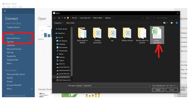
- Step 1 : Open Tableau Desktop and choose Microsoft Excel from the Connect menu on the interface’s left side.
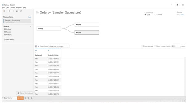
- Step 2 : As illustrated below, enter the example dataset and establish the relationships between the various tables:
- Step 3 : Here, you may also make some adjustments to the datasets, such as adding extra rows or columns, getting rid of extraneous information, changing null to certain default values, and more.
- Step 4 : When you’re finished making all the necessary adjustments, select sheet1 in the bottom-left corner to return to the worksheet.
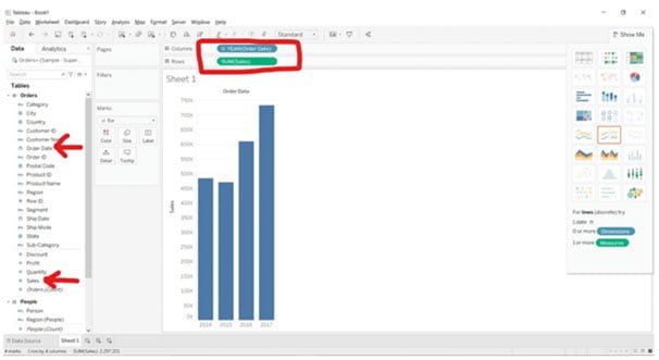
- Step 5 : Pick the Sales dimension from the Data panel, which is located on the left side of the Tableau interface, and place it in the Rows section directly below the toolbar. Drag and drop the Order Date dimension into the Columns area in a similar manner.
- Step 6 : If your visualization changes after you’ve removed the other dimensions, simply swap the two, and the bar graph will come back to life.
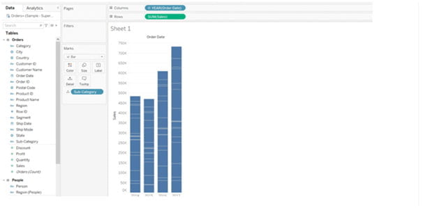
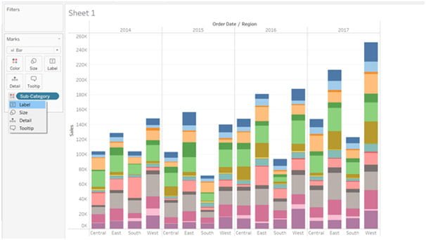
- Step 7 : Now let’s make our basic bar chart into a stacked one and add another dimension to it. Drag the Sub-Category dimension into the Marks section to do this.
- Step 8 : Additionally, you may create four distinct sections—one for each year—by adding the dimension Regions to the Columns section.
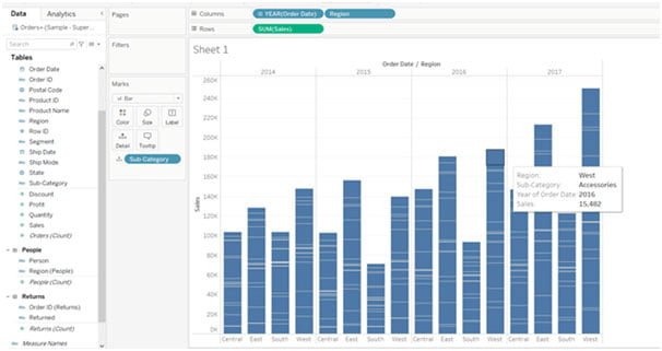
- Step 9 : By putting the Color card on the Sub-Category dimension, you may also choose to give your stacked bar chart distinct colors for each section.
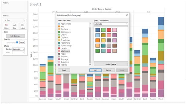
- Step 10 : Click on the Color option in the Marks sections, choose Edit Colors, and alter the colors to change the color of the stack’s bar.
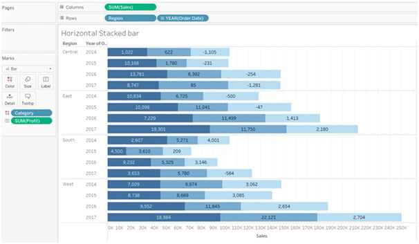
Create a horizontally stacked bar graph. Tableau
To create a horizontal stacked bar in Tableau, follow these instructions :
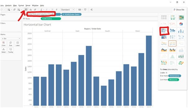
- Step 1 : Choose any two dimensions to drop in the rows and columns section when adding a new worksheet from the bottom left corner. Take the dimensions Region & Order Date for the column portion as an example, and Sales for the row section.
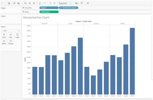
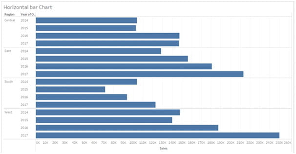
- Step 2 : You can see that a vertical chart has been made in the image above, but we want a horizontal one. Therefore, choose Horizontal bars from the Visualization panel or click on the Swap (or Ctrl+W) button directly beneath the Server option to turn this figure into a horizontal bar chart.
- Step 3 : The transformed chart would seem as follows:
- Step 4 : Let’s change our horizontal chart into a stacked bar chart by adding the Category and other dimensions as labels or colors.
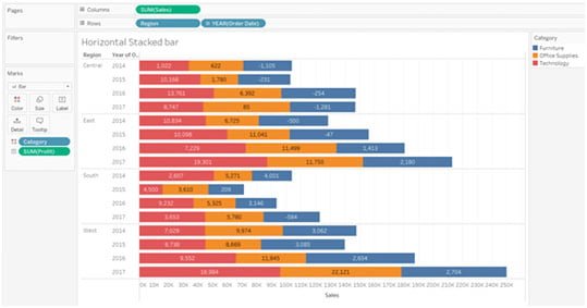
- Step 5: You may add extra labels or set action filters to your bar chart to add information or make it interactive.
Tableau Stacked Bar Chart Creation with Multiple Measures
The Tableau Stacked bar chart may also be made using various measurements. Let’s follow the instructions below to construct a Tableau stacked bar chart with several measures :
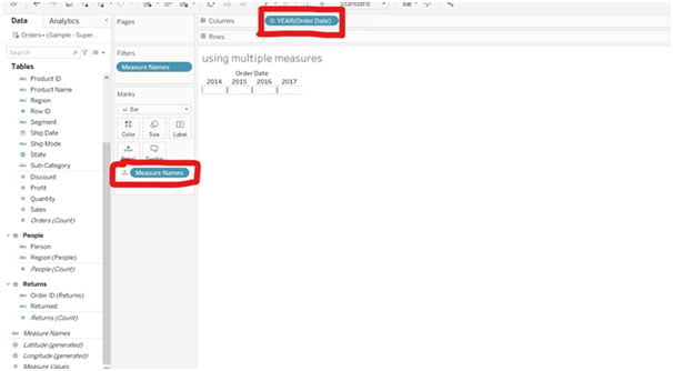
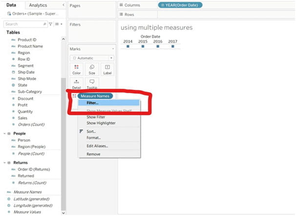
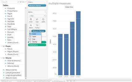
- Step 1 : Open a tableau worksheet, and then add Order Date and Measure Names to the column and marking sections, respectively.
- Step 2 : Select the Filter option from the Measure Names drop-down menu by clicking on it.
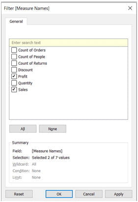
- Step 3 : Apply the modifications by selecting only the Sales and Profit measure in front of the dialog box.
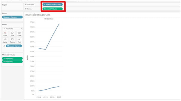
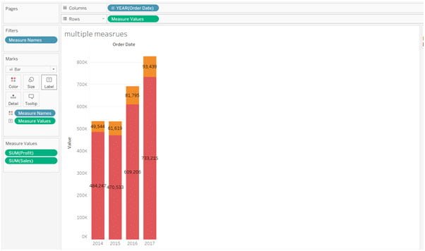
- Step 4 : After that, a line graph will show up on the screen when the Measure Values are dropped into the Rows area.
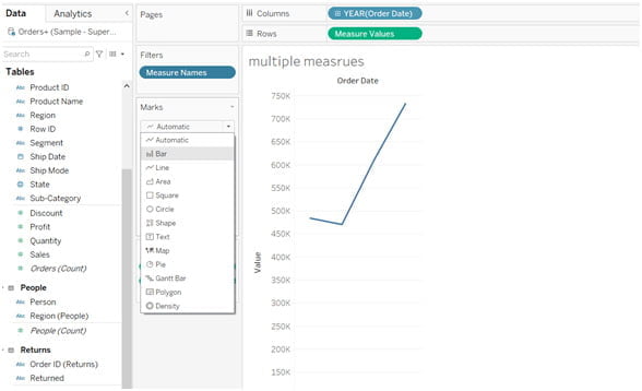
- Step 5 : Click the Bar option in the drop-down menu that appears under the Marks section.
- Step 6 : A Each bar will be divided into segments based on profit on a stacked chart. By switching the Measure Name from Details to Colors in this case, you may assign several colors.
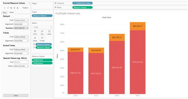
- Step 7 : After changing the measure names, hold down the Ctrl key and drag and drop the measure values onto the labels in the Marks section.
- Step 8 : Using the drop-down menu, you can now style the Measure Values and scale the bar chart to your preferred size.
Following the creation of a stacked bar chart, let’s see how to modify it by adding various labels, measurements, percentage labels, and other features.
Guideto Add Features to a Tableau Stacked Bar Chart
There are various methods to improve results and make your bar chart more dynamic. You may, for instance, display the amount of profit you’ve made in various states or areas. By using the Quantity measure, you can check how many items have been sold out as well.
Additionally, you can alter the order in which you see the values in your Tableau Stacked Bar chart and arrange them in either ascending or descending order. To produce some of these metrics or labels, let’s go through the method described below:
Steps to add the stacked bar chart total in Tableau?
The procedures for creating and adding the total to the stacked bar chart in Tableau are as follows:
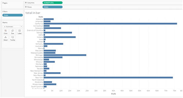
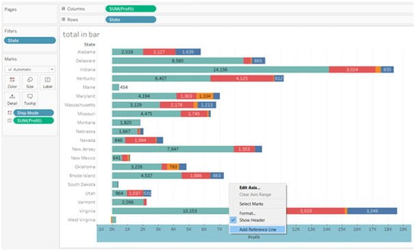
- Step 1 : Use the Profit and State as the dimensions for your bar chart. To improve the clarity and simplicity of the visualization for this tutorial, some of the rows were eliminated. You may accomplish this by selecting the State and selecting Exclude from the dropdown option under the filter.
- Step 2 : Label the labels in the Marks section with the Ship Mode dimension in the Colors and Profit. There will be a chart with stacked bars.
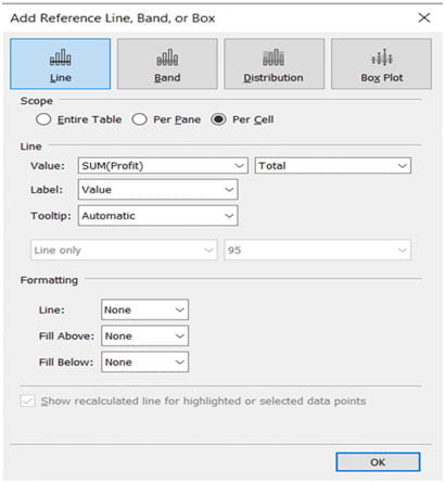
- Step 3 : Right-click the row panel again and choose “Add Reference Line” from the menu that appears. There will be a dialog box. Make the precise adjustments as indicated in the accompanying image, then click OK.
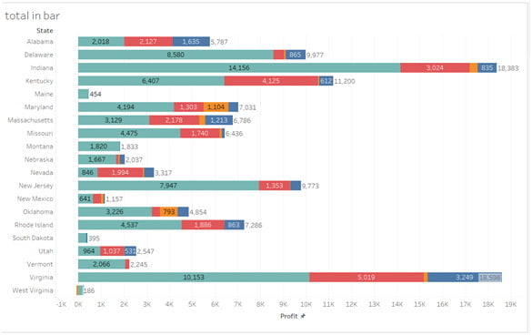
- Step 4 : The final visualization will seem as follows.
Modifying the Stacked Bar Chart’s color scheme
Additionally, Tableau gives you the option to modify the colors of certain segments or even add new colors by developing a color palette. The steps for adding a color scheme to the Stacked bar chart are as follows :
- Step 1 : Click the Color button in the Marks section of any bar chart, such as the horizontal bar chart, to change its color. On the screen, a dialog box will open after selecting modify Colors.
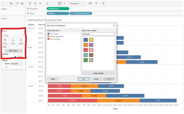
- Step 2 : From here, you may choose a new color scheme, give a color palette, or choose several shades of the same hue.
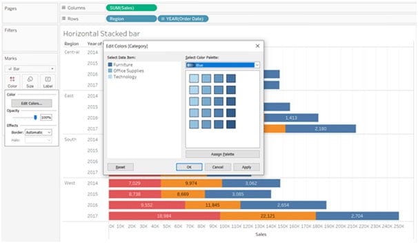
- Step 3 : This stunning Stacked bar chart is the result of giving the various elements three distinct shades of blue hue dependent on where they are in the bar segment.
Conclusion
So that was everything there was to know about making a stacked bar chart and utilizing it in Tableau in various ways. One of the most popular visualizations in business intelligence and analytics are bar charts. You may compare many categories and include various data values in a single presentation by using stacked charts. Enroll for the Best Tableau Course in Chennai with Placement Assistance.