
Learn Everything About Different Ways To Use Dual Axis Charts in Tableau
Dual axis charts integrate views of two or more metrics into a single chart. For quick data insights and comparison, Tableau dual axis charts combine two or more Tableau measurements and exhibit correlations between them.
The steps you can use to generate dual axis charts in Tableau are explained in this article, along with their advantages and disadvantages. Become a master in data visualization skills by learning the Best Tableau Course in Chennai at Softlogic.
Why Tableau Charts?
Information can be seen more effectively with Tableau charts. These data visualizations help in data tracking, trend comparison, future company planning, and decision-making.
Additionally, Tableau charts reduce the need to manually search through databases or excel sheets. They help you to quickly and effectively construct data models and assess your company’s performance.
What is a Dual Axis Chart in Tableau?
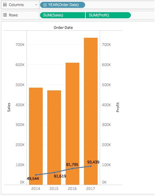
A chart with two sets of data layered on top of one another with a shared axis is referred to as a dual axis chart. On each side of your chart, for instance, you might have a distinct Y-axis for each of the two measures of sales and profit, together with an X-axis for date (months) values.
This enables you to assess profit and sales data over time. You can format your chart in dual-axis so that there is a different marks card for each axis. In our example, we’re using a bar chart to show sales numbers and a line chart to show a profit.
How to create a Tableau dual axis chart
Step 1: The creation of a graph for one of your metrics is the initial stage in the creation of dual axis charts.
Step 2: The second measure is then dragged onto the row shelf. At this point, Tableau will produce a second graph, which is technically a dual axis chart. but not a combo chart with two axes.
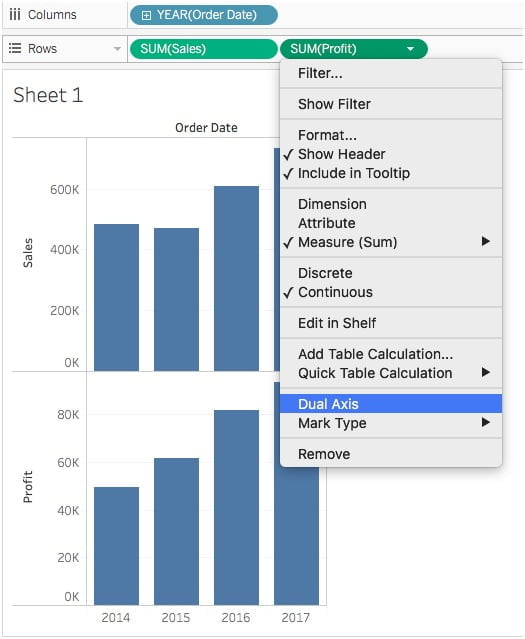
Step 3: You must choose whether the synchronization of the two axes is necessary. Select Synchronize Axis by performing a right-click on the right axis if the unit of measurement is the same for both measurements.
By doing this, the secondary axis’ scale is brought into line with the first axis’ scale. In our article, the Sales axis is the primary axis and the Profit axis is the secondary axis.
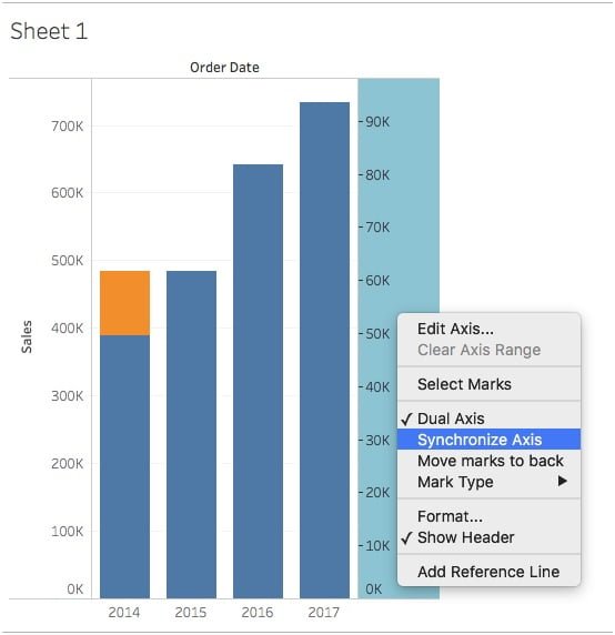
Step 4: Alternatively, you can rearrange the fields in the row shelf so that different fields alternately serve as the primary and secondary axes by hiding one of the axes and showing the values on the graph area.
Step 5: To turn off the labels on the right side, right-click the axis and choose Show Header. To advance one measure, switch one measure in the Rows shelf from one side to the other.
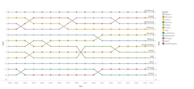
Important Note : Dual axes with different numeric data formats can be synchronized. An axis that uses an integer data type and an axis that uses a decimal data type, for instance, can be synchronized. If you want to construct a more unique chart, such as a ranking chart, it can be helpful to understand the reasoning behind dual axis charts.
Dual-Axis Layered Maps
In the context of maps, you can expand the potential of these charts by creating dual-axis (layered) maps by superimposing two sets of geographic data on top of one another.
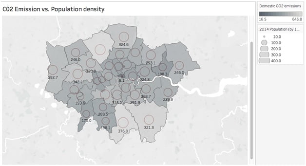
For instance, you might make a map with geographic data points for cities that you mapped for another measure and polygon areas filled with one measure. In the example below, we used circle sizes to map the population of each borough on the second “layer” of our map after mapping CO2 emissions per borough of the city of London.
These maps may be made in Tableau in a variety of methods, which we will go through in a subsequent topic. Using either strategy will rely on the kind of geographic information you gathered (latitude and longitude generated polygon data or a combination).
Conclusion
Dual axis charts can be used to map relationships between two or more variables. These are helpful for people to swiftly assess data points or trends and make decisions since they can be customized to display a lot of information in a little space.
Create an appealing visualization by learning at our Tableau Training Institute in Chennai with Best Practices.