
Funnel Chart in Tableau
How to Create a Funnel Chart in Tableau
A funnel, also known as a pipeline, a sales process, or a cycle, helps you make sense of your sales data.
A funnel can help you recognize customers who are trying to drop out of the sales process, understand your purchasers’ buying patterns, and visualize whether you have enough prospects to meet a sales target.
Join Tableau Training in Chennai to gain expertise in the data visualization process.
Funnel Chart in Tableau
Let’s consider an example for creating a “Funnel Chart in Tableau” for analyzing an airline e-commerce website funnel and it should be used for visualizing the sales pipeline of a company.
Here are the various ways to create funnel chart-based visualization in Tableau.
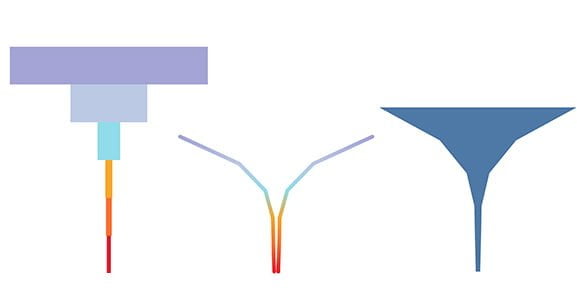
Generally, three common formats can be used to create a Funnel Chart in Tableau and it will vary according to your sales target.
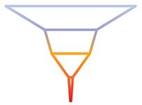
• It must be in funnel shape but not bars on top of one on one.
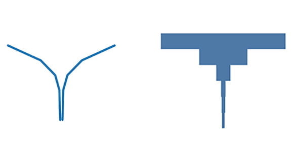
It shouldn’t be like
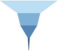
• It must be distinguished with different colors.
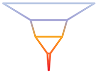
• It must be segmented and filled with color
Simple Approach
This is the easiest method for creating a colored bar or line funnel, or a funnel shape with no gaps between the steps.
Following are the five steps used to create a visualization with a Funnel Chart in Tableau.
or or
1. Copy the measure you’d like to use to visualize with the funnel (customers, revenue, visits).
2. Place the two measurements on the column shelf.
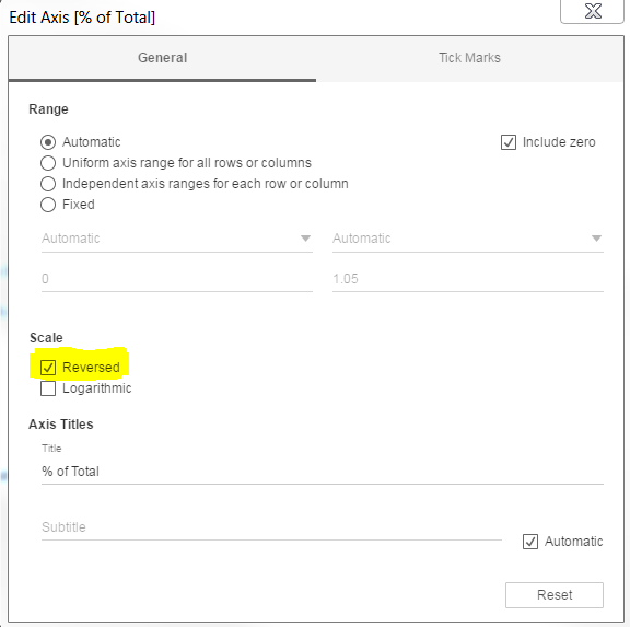
3. Invert one of the two measurement axes. Double-click on the X axis to reveal the option:
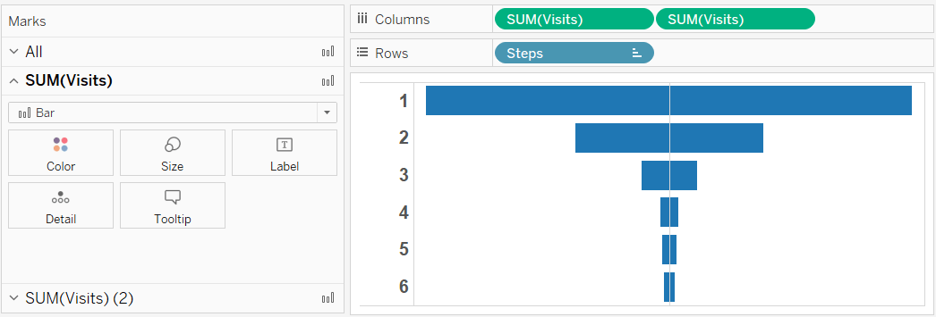
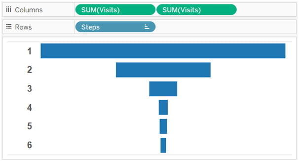
4. Add to the Rows shelf the measurement you should be using to divide your funnel (the sales stages, the steps, the pages types, etc.). You should finish up with something as follows:
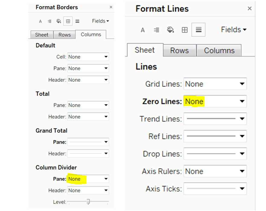
5. Don’t miss to customise your formatting to remove any lines, particularly the column dividers and the Zero Line, which would otherwise split your funnel in half.
The Measure Values Approach
Use this method to create a funnel shape with distinct steps.
Sales funnels with a true funnel shape look far superior to bar funnels.
They also enable you to color-code each step and use the funnel as a color legend.
Adam Crahen created a fantastic visualization explaining a simple and effective technique for creating this type of funnel.
Adam’s procedure includes reusing the measure you want to use to draw your funnel (as we did in the previous step) and using the same axis as the Measure Values field. This is how it appears:
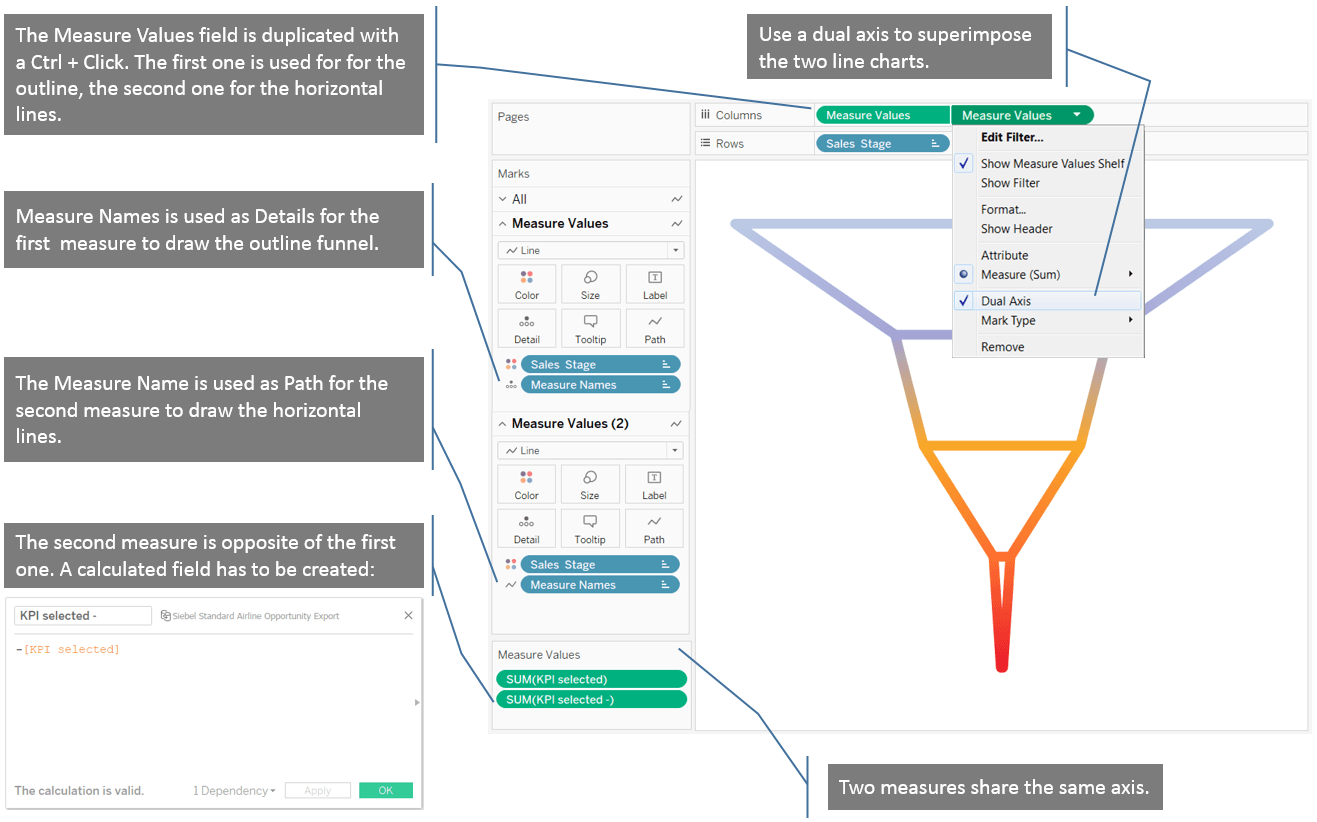
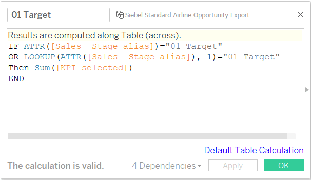
Table Calculation Approach for Measuring Values
This is the most advanced method, but it’s not difficult if you want a filled funnel shape with colored steps.

The following are the further steps concerned in this.
1. Creating two calculated fields for the first funnel stage.
• Create the first field with this table calculation that allows you to draw one area at a time:
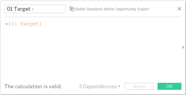
• Create a second field to develop the opposite side of the funnel. It will be the negative value of the previously calculated field, as in the previous approach:
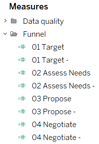
2. Create the same two calculated fields for each stage of your funnel. This is how my Measures pane looks after I’ve created all of the calculated fields:
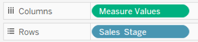
3. Using a blended axis, place all of those measurements on the same axis. Put the following new Measure Values field on the Columns shelf:
4. If you do not disable the Stack Marks option, you may get this type of funnel:
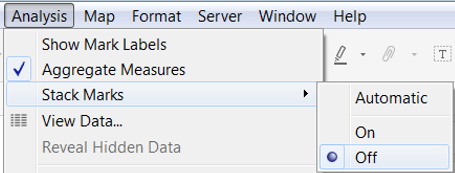
This is what it should look like after you disable the Stack Marks option:
5. Finally, Finish by adding an axis to each stage and adding a title and label. Type “max(1)” directly into the Columns shelf, add labels and place the labels on top of your funnel using a dual axis (as we did in the second approach).
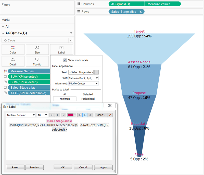
This is how it will look (all of the numbers in this viz are fictitious):
Conclusion
Understanding how to create funnels in Tableau is a valuable foundational skill with numerous applications.
Learn Tableau Course in Chennai with Hands-on exposure and discover the range of opportunities in the field of Data Science and data visualization.