
Heatmap in Power BI
Step-by-step guide for Creating Heatmap in Power BI
Heatmaps are a commonly used type of visualization being used in “Power BI“ dashboards for mapping analysis and representing geospatial data.
We will discuss these maps, their applications, and how to create a Power BI heatmap on the desktop through this article.
Learn the Best Power BI Course in Chennai at Softlogic Systems for a promising future in data visualization.
What is Power BI?
Power BI offers a variety of data analytics and visualization tools that allow users to generate insightful dashboards or reports and employ them to produce data-driven decisions.
We could even easily integrate data from various sources and transform it into important insights.
The Power BI heatmap is one of the most popular visualizations used by data scientists to illustrate distributed networks, advertisement impact, and so on.
So, let’s take a closer look at how to make these visualizations in Power BI Desktop using Heatmap.
Overview of PowerBI Heatmap
A heatmap is a type of personalized visualization used by industry experts to depict the relationship between two factors obtained by plotting on a map as various color clusters.
It allows the user to visualize hidden patterns and identify the changes across all axis. In a heatmap, the areas with the highest data density are defined by the darkest color, followed by lighter shades corresponding to the density.
This color pattern can be denoted using tables, histograms, or geographical maps.
Key Features of Power BI
Following are the unique features of Microsoft Power BI
Data Selection : With Power BI, you can filter your datasets to prioritize small but highly relevant datasets.
This allows you to focus on individual data points in the dataset rather than the entire dataset at once.
Responsiveness : Accessing presentations and reports on mobile phones can sometimes interfere with responsiveness.
Power BI, on the other hand, supports viewing enlarged Navigation Trees on both iOS and Android platforms.
To ensure that all of the information is visible, you can zoom in or out of the Reports or Graphs.
Seamless Functionalities : Power BI includes drag-and-drop functionality, which allows you to quickly create customized reports.
It also enables you to delve deeper into the data visualizations to gain a better understanding of the data.
Natural Language Queries remove the need for users to learn a complex query language.
Data Connectivity : Power BI supports a variety of connectors that integrate with Cloud data.
This enables companies to easily view metrics or visuals.
The connector directly integrates the data source, and once the data is successfully retrieved, you can create interactive visuals to identify trends and patterns.
Applications of Power BI Heatmap
Heatmaps in Power BI Dashboards can be used in the following ways by an organization :
Businesses can use heatmaps to find new distribution or service center locations.
By analyzing customer density with color patches, businesses can map the locations from which they can provide efficient services to the greatest number of customers.
By mapping the data sets gathered from various websites, you can easily identify the locations to run your marketing campaigns and reach out to relevant customers.
Use demographic data, for example, to determine where the majority of your target customers live and when they are most likely to see your campaigns.
Demographic Heatmaps can also be used to identify areas where a company can grow and open a new franchise to maximize profits.
Radius analysis can be used to create customer clusters within the expected area surrounding a new franchise.
Heatmaps are useful in the sports industry as well. You may have seen a Heatmap during a cricket match demonstrating a batter’s favorite zones to play a shot and similarly demonstrating what are the lines where bowlers are getting the most wickets.
How to Create Power BI Heatmap?
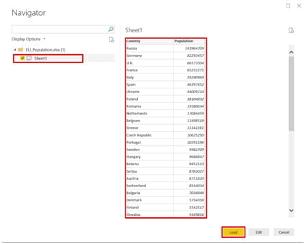
Let us create a Power BI Heatmap representing the population of European countries for this tutorial. You can access the dataset from here, and we recommend that you copy it to an Excel spreadsheet.
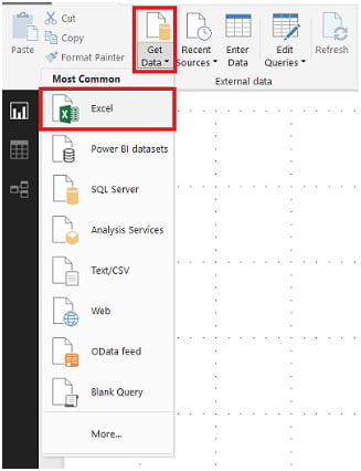
-
- To load the data, select the desired Excel file.
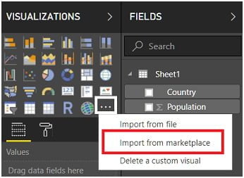
Import Custom Visualizations in Step 2
Because Power BI lacks an in-built Heatmap component, you must create the Power BI Heatmap using custom visualizations. Following steps help you to do Power BI Heatmap efficiently
-
- Go to the Visualizations Panel and select the three dots.
- Choose the Import from Marketplace option now.
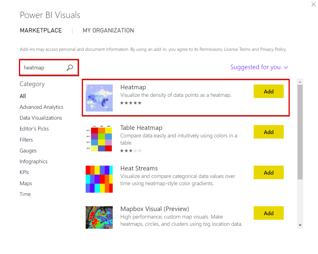
-
- Add Heatmap by searching for it.
-
- Drag the custom visual Heatmap component into the Power BI Design Panel at this point.
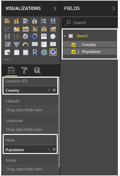
- Drag the Country field over to the Location field (ID).
- Drag the Population field to the Value field.
-
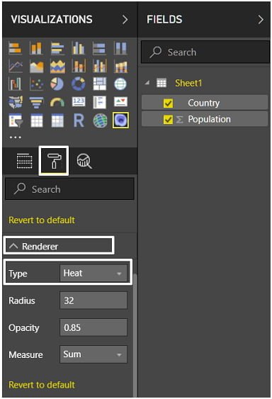
- Change the Renderer Format to Heat, which can be found in the Format Properties of Heatmap.
-
- As a result, our European country population heatmap will look like this:
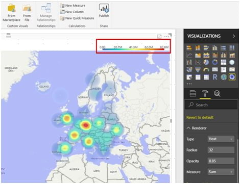
- The legend, which represents the value ranges, is located at the top of the heatmap, which is an interesting feature of this Power BI Heatmap.
Things to keep in mind when using Power BI Heatmaps
There are some important considerations to make when creating Heatmaps in Power BI. Here are a few examples:
- Power BI Heatmaps are customized visualizations available only through the Power BI Marketplace.
- Power BI Marketplace contains several rarely used visualization charts. The only place where you’ll find common charts is in the visualization section.
- Always use a color that represents heat or density when creating a Heatmap.
- Heatmap is only concerned with numbers.
Conclusion
This blog presented you with Power BI as well as some of its key features.
You also learned how to use Power BI Heatmaps for Data Visualization.
In addition, this article outlined the steps required to create a Power BI Heatmap. Learn Power BI Training in Chennai with Best Practices to gain field expertise required in the global industries.