
Gauge Chart in Tableau
How to Create Gauge Chart in Tableau
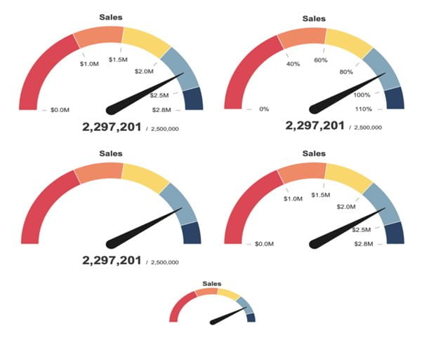
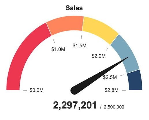
A Gauge Chart is used to display the performance of metrics related to scale with a needle on a dial. It is in Tableau and is widely used for creating executive dashboards. Gauges are making use of the needle and the color of the dial to assist users to understand the performance quickly.
In this article, we show you how to create a Gauge Chart in Tableau that can be customized and scaled as per the data for fitting various scenarios.
Enroll for the Best Tableau Training in Chennai at Softlogic Systems to get trained practically on creating gauge charts for executive dashboards.
When can we use Gauge Chart?
A gauge chart is most beneficial when it is used with other gauge charts. This will help your customers comprehend the significance of ongoing performance about perceptions.
Before we begin, there are plenty of resources available for a simple gauge chart, including some of our existing approaches, the Flerlege Twins. The primary objective of this solution was to generate a gauge chart that was both visually appealing and free of images. The steps for creating the chart are outlined here.
Step 1: Make the dial
We will create a separate data source to build the gauge. Don’t be concerned; this data source will easily integrate with any other data source. The data source has two columns: one called [value] that counts from 0 to 401 and repeats five times, and another called [value] that counts from 0 to 401 and repeats five times.
The second column is labeled [level], and the numbers in it range from 1 to 5. Each of the five iterations of the numbers in the [value] column is covered in this column.
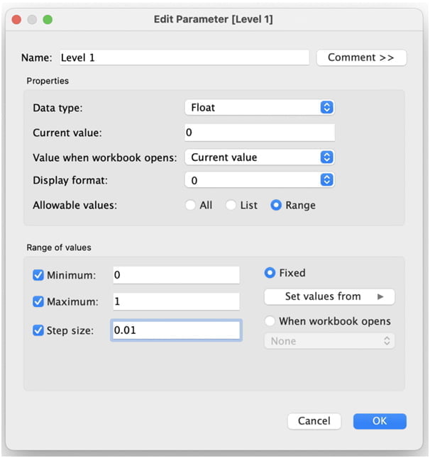
After downloading the data source, connect to it in Tableau and create an extract. Now, we’ll create five Float parameters on a new sheet. These parameters will assist us in sizing the gauge dial.
The first three are referred to as [Level 1], [Level 2], and [Level 3]. All three parameters have a range of 0 to 1 and a step size of 0.01. Set the [Level 1], [Level 2], and [Level 3] values to.4,.6, and.8, respectively.
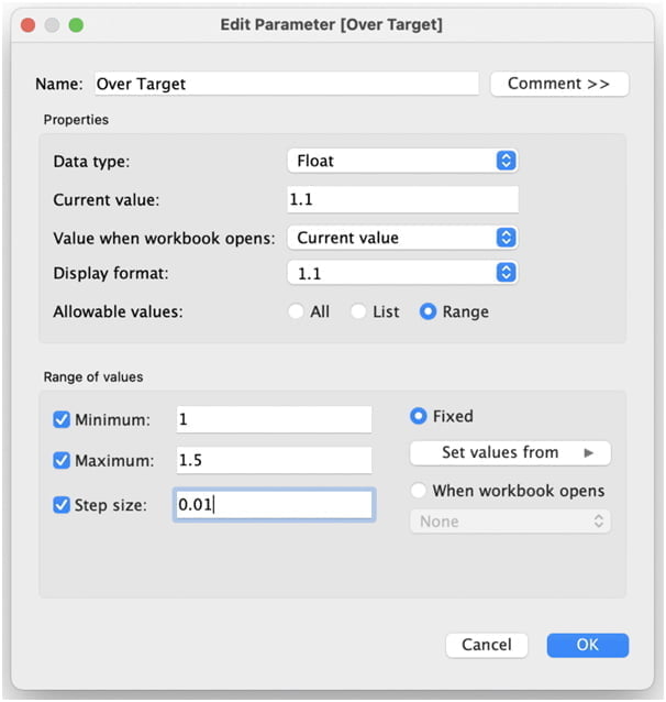
Create a fourth parameter called [Over Target]. This will also be a Float parameter, but the range will be between 1 and 1.5 with a 0.01 step. Set the value to 1.1.
The final parameter will be called [size], and it will help us determine the width of the band on the dial. Fix the range between 0 and 1. Set the value to.2. Now that we’ve defined these parameters, let’s work on the calculations that will be used to build our dial.
This chart will use polar coordinates, so it will remind some of the geometry class. This means we must first specify the radius and degrees of the dial. To accomplish this, we will perform four total calculations. Let’s start by calculating how far each part of the dial will arc.
Make a [Depth] calculation and enter the following:
// Depth
CASE [Level]
WHEN 1 THEN [Level 1]
WHEN 2 THEN [Level 2]
WHEN 3 THEN [Level 3]
WHEN 4 THEN 1
WHEN 5 THEN [Over Target]
END
We’re deciding how far each arc should go here.Let us now compute the [Dial Degrees].
// Dial Degrees
PI()*(IF [Value] <= 200
THEN [Value]/200
ELSEIF [Value] <= 401
THEN (200 – ([Value] – 201))/200
END)*([Depth]/[Over Target])
Then comes the [Dial Radius].
// Dial Degrees
IF [Value] <= 200
THEN 1
ELSEIF [Value] <= 401
THEN 1 – [size]
END
We can then use [Dial Degrees] and [Dial Radius] to create a map layer called [Dial] that will generate the dial for us.
// Dial
MAKEPOINT(
[Dial Radius]*SIN([Dial Degrees]),
-[Dial Radius]*COS([Dial Degrees]) )
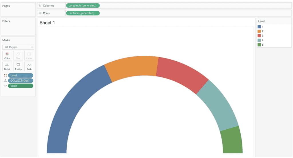
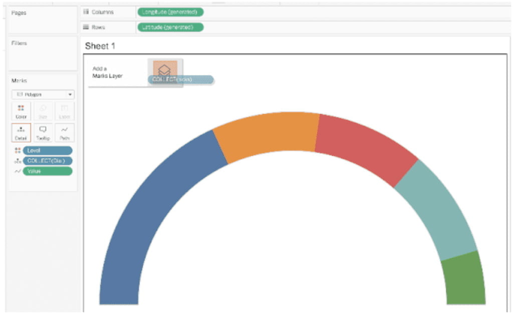
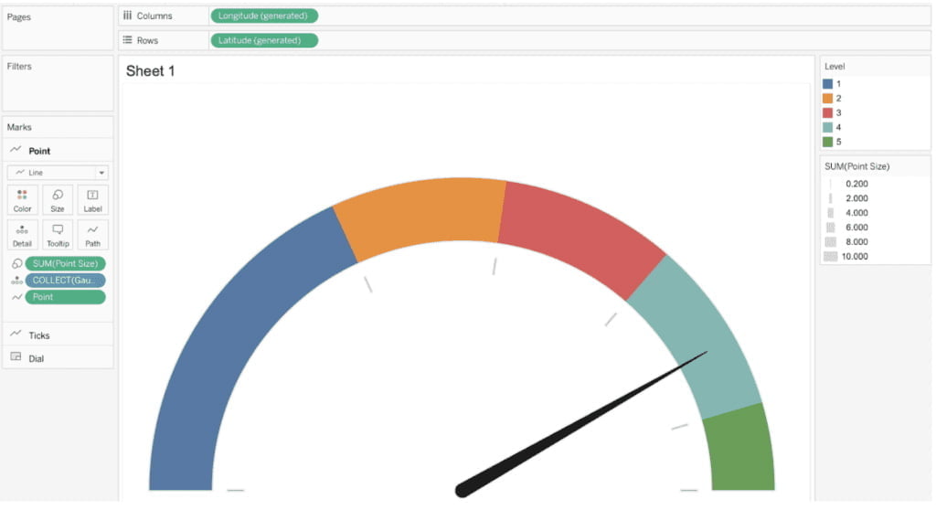
Now that you’ve created [Dial], Place this map layer on top of the visualization to add [Longitude (generated)] and [Latitude (generated)] to the Columns and Rows shelves. Add [Level] to the color as a discrete dimension. Change the mark type to polygon, then drag [Value] as a continuous dimension onto the path. Disable your tooltips.
Here is the output of the dial to the gauge.
Step 2: Create the Ticks
Let’s make the ticks now that we have the dial. We’ll use the same data source as we did for the dial. Create a float parameter called [Tick Length] first. The length of the ticks will be determined by this.
Use a range of.01 to.15 with steps of.01. Change the value to.05. Three calculations will be required: [Tick Degrees], [Tick Radius], and [Ticks].
// Tick Degrees
IF [Value] IN(0, 1, 2, 3, 4, 5)
AND [Level] = 1
THEN 1 – [size] – .05 – [Tick Length]
ELSEIF [Value] IN(6, 7, 8, 9, 10, 11)
AND [Level] = 1
THEN 1 – [size] – .05
END
// Tick Radius
CASE [Value]
WHEN IN(0, 6) THEN 0
WHEN IN(1, 7) THEN [Level 1]
WHEN IN(2, 8) THEN [Level 2]
WHEN IN(3, 9) THEN [Level 3]
WHEN IN(4, 10) THEN [Over Target]
WHEN IN(5, 11) THEN 1
END * PI()/[Over Target]
// Ticks
MAKEPOINT(
[Tick Radius]*SIN([Tick Degrees]),
-[Tick Radius]*COS([Tick Degrees])
)
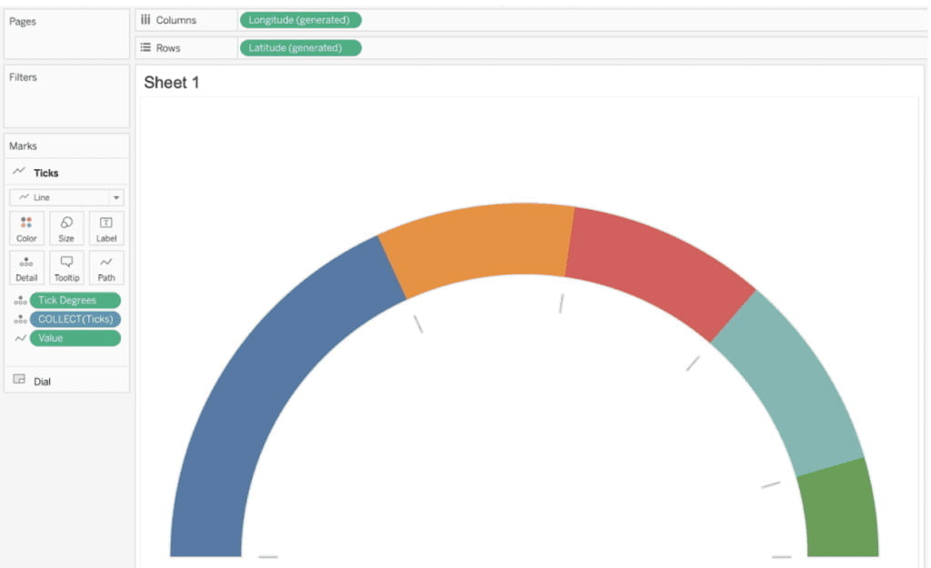
After you’ve created [Ticks], drag this calculation over to the existing sheet and add it as an additional map layer.
Change the mark type to Line after adding the map layer. Add [Tick Degrees] as a continuous dimension to the detail. Add Value as a continuous dimension to the path, then reduce the size to the smallest value possible.
One thing that hasn’t been mentioned yet is what [Level 1], [Level 2], [Level 3], and [Over Target] add to the visual. If you change the values in these parameters, the dial’s color will change. In general, you should aim for [Level 1] [Level 2] [Level 3] 1 [Over Target]. When you update, you’ll see how the color on the dial is changed.
If you also change the size, you’ll notice how that value changes the width of the dial’s band. So far, we’ve developed a gauge chart that can be used with any data source. In the following section, we will connect to a data source and create the gauge chart.
Step 3: Create the Pointers
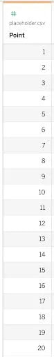
We will connect to the Sample – Superstore data source for this example. As you construct your data source, you will create a logical join (relationship) between it and a second data source that you will need to construct. Create a CSV with a single column called Point that counts up from 1 to 20 using your preferred tool.
This data source will be called “placeholder.csv.” Then, add another connection to the data source.
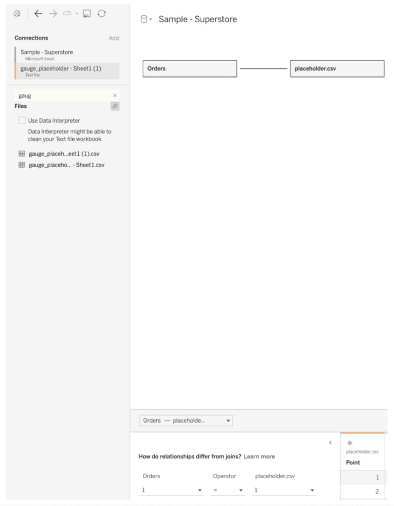
Make a logical join with Sample – Supermarket, and placeholder.csv. Make calculated joins and set the value of each side to 1. This will result in a many-to-many relationship, but it will not affect on the work we will do.
We must calculate the radius and degrees once more before creating a map layer. To build the calculations, we will use the join that we created. You must create these calculations using the data source that contains your key metrics. It is Sample – Superstore in this case.
But, before we begin, we must first establish a goal. In this example, we’ll put a sales goal in a float parameter called [Target]. Let’s set the goal at 2,000,000. We must also define a key metric.
This is the value that will be compared to the target. I’m going to use total sales in this example. Let’s put that total in a new calculated field called [Key Metric].
// Key Metric
SUM ([Sales])
Let us now compute the pointer’s degrees. Make a calculated field called [Point Degrees] and fill in the blanks with the following:
// Point Degrees
CASE [Point]
WHEN 1 THEN 0
WHEN 2 THEN MIN({[Key Metric]}/[Target]/[Over Target],1)
END * PI()
You are defining values for the placeholder’s first two rows with this calculation. data source in the CSV. The pointer for Point 1 is centered at 0. For Point 2, the value is expressed as a percentage of the target.
If that target exceeds the maximum value, the arrow will simply move to the top of the gauge. Let us now compute the [Point Radius]:
// Point Radius
CASE [Point]
WHEN 1 THEN 0
WHEN 2 THEN 1 – [size]/2
END
The point will now be in the center of the dial. Let’s make the map layer now. It’s known as [Gauge Point].
// Gauge Point
MAKEPOINT(
[Point Radius]*SIN([Point Degrees]),
-[Point Radius]*COS([Point Degrees])
)
Take the [Gauge Point] calculation and add the map layer to the sheet’s visualization. You can add multiple data sources to the same map in Tableau without performing a blend thanks to mapping layers. Change the layer’s name to Point.
Change the line’s mark type. Add [Point] to the path as a continuous dimension. Make a new calculation, [Point Size]:
// Point Size
CASE [Point]
WHEN 1 THEN 10
WHEN 2 THEN .2
END
Include point size to size. Change the size of the pointer to your liking. Make the color black.
Your gauge is now operational, but it requires labels.
Step 4: Add the Labels
To add labels, we must first calculate the degrees and radius of these points, and only then can we add labels. Make a [label padding] float parameter. This creates space between the end of the tick and the labels. Change the value to 0.1.
The advantage of using a parameter for this is that you can quickly update the parameter to add spacing as you resize your gauge. Add [Labels Degrees] and [Labels Radius] calculations to the Sample – Superstore dataset.
// Label Degrees
CASE [Point]
WHEN 1 THEN [Level 1]
WHEN 2 THEN [Level 2]
WHEN 3 THEN [Level 3]
WHEN 4 THEN 1
WHEN 5 THEN [Over Target]
WHEN 6 THEN 0
END * PI()/[Over Target]
// Labels Radius
CASE [Point]
WHEN IN(1, 2, 3, 4, 5, 6) THEN 1 – [size] – .05 – [Tick Length] – [label padding]
END
Use the following two calculations to create a map layer called [Labels]:
// Labels
MAKEPOINT(
[Labels Radius]*SIN([Labels Degrees]),
-([Labels Radius] – .05)*COS([Labels Degrees])
)
If you look closely, you’ll notice an additional -.05 in the make point calculation. That is, the left-right alignment should be adjusted because the text is typically wider than it is tall.
To the visualization, add the [Labels] map layer. Labels should now be the layer name. Set the mark type to text. To detail, add [Point] as a continuous dimension.
Create a new calculation called [Labels Key Metric] for the labels:
// Labels Key Metric
CASE [Point]
WHEN 1 THEN [Level 1]
WHEN 2 THEN [Level 2]
WHEN 3 THEN [Level 3]
WHEN 4 THEN 1
WHEN 5 THEN [Over Target]
WHEN 6 THEN 0
END * [Target]
This calculation makes use of the gauge size and target parameters to generate labels automatically.
Add [Labels Key Metric] to the text and format it.
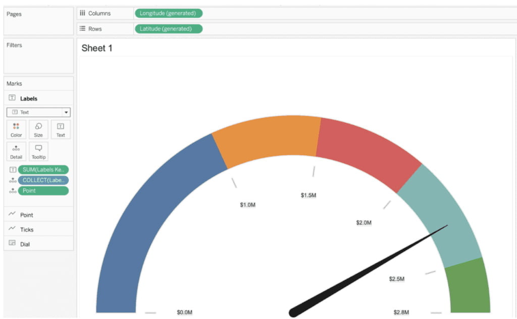
The construction is nearly finished. The final step is to add labels to the gauge, including the actual values and the target.
Step 5: Add Labels
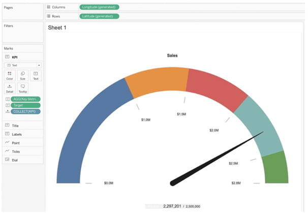
Let’s start with a title. Calculate with the name [KPI Name].
// KPI Name
MAKEPOINT(1.1, 0)
Add another map layer called [KPI Name]. Name the Title to theLayer. Set the mark type to text. Set the value of a new text parameter called [KPI Name] to Sales. Make the title larger than the tick labels in the text. In this example, I’ll use font size 11 as the value.
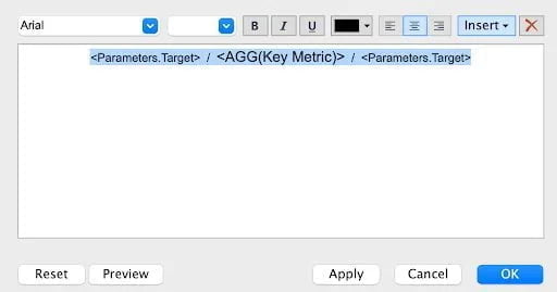
Let’s add labels to the key metrics now. Make a calculation named [KPI].
// KPI Name
MAKEPOINT(-.2, 0)
Add this calculation as an additional map layer. Maintain the same layer name. Set the mark type to text. Text should include [Key Metric] and [Target]. Edit and format the text as desired.
Here is the output
Step 6: Finalize the Visualization
In the final step, you must perform some minor cleanup. First, select the “Point” map layer and drag it above the “Labels” map layer. You’re doing this so that the gauge appears above the visualization’s labels. Change the colors on the dials next. This will make the graph easier to understand.
After that, disable the background maps. You can do this by selecting Maps from the top menu, then Background Maps, and finally None.
This will disable much of the mapping and allow for some additional formatting. Following this step, your chart may look like this:

- First, make changes to your axes. Set your longitude to somewhere between -1.1 and 1.1 degrees. Set the latitude axis to be between -0.4 and 1.2 degrees. Then conceal these axes.
- Then, on the sheet, hide all rulers, lines, ticks, and dividers.
- Then, conceal your nulls.
- Finally, on the “Dial” layer, click on color and change the border to white.
This completes the construction of your gauge. All you have to do is add it somewhere on your dashboard. When adding it to a dashboard, keep in mind that the ideal ratio is eight units tall for every 11 units wide. This will keep the gauge’s shape circular.
Conclusion
The goal of this tutorial was to make a gauge chart that would look good on any dashboard. In addition, I wanted to make it highly customizable by incorporating map layers and parameters. You can toggle any part of the gauge chart using map layers.
You can quickly change the size of almost any component using parameters to display the information of interest. Learn the Best Tableau Course in Chennai at Softlogic Systems with Best Practices.