Must Know Tableau Tips and Tricks for an Appealing Data Visualization
Since there is so much important data to deal with, small and large organizations require resources that can interact with and analyze data in order to gain key insights. In this article, we present Ten popular Tableau Tips and Tricks that successfully produce insights.
Each is a comprehensive case study that contains concepts you can use in your own work. You can use it right away to improve the effectiveness of your dashboards through the given examples.
Join our Tableau Training in Chennai at Softlogic to learn more tips & tricks and to master the art of dashboarding.
1. To see changes, modify a calculation on the dashboard
We modify (or develop) computations every day to observe how they affect the sheet we are working on. However, you can update a calculation and then go to the dashboard to see how that calculation affects the whole dashboard while the edit window is still active.
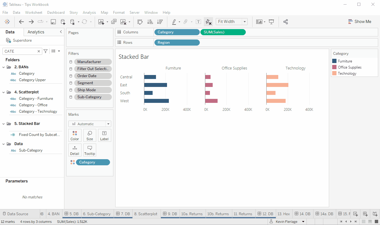
2. Build a stacked bar for the entire value
Assuming you are using Superstore data, make a bar chart using Area on Rows, Category on Columns, and Category on Color for each region and category. This becomes a single color when you tally up the totals. But if you duplicate the Category field and put it on color, you can make this overall sum into a stacked bar.
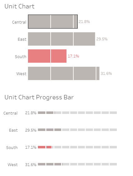
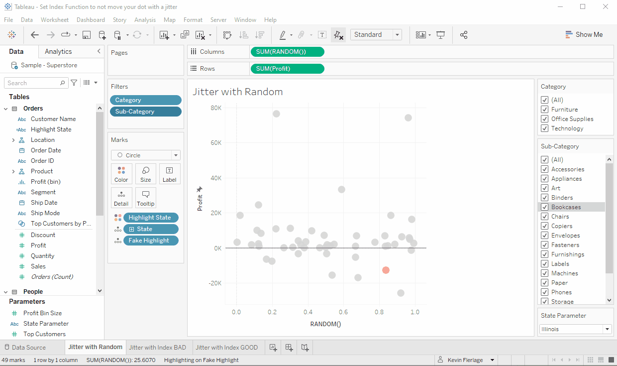
3. Simple Unit Charts Can Be Made With Just One Distribution
White continuous lines can be used to create a straightforward unit chart (or unit progress bar). Placements for these lines are 10%, 20%, 30%, and 100%. This makes the chart really simple to read.
It can be done with a single distribution as follows
4. The filter has a clear grey band
When using a filter, you may occasionally choose to click the value’s name rather than the actual checkbox. When you do, a grey ring is displayed above that value. I couldn’t figure out how to get rid of that for the longest time. In actuality, it’s pretty easy. Simply click outside of the values and in the empty area inside the filter object. To achieve this, you might need to enlarge the filter object, and it might take a few clicks to reach the ideal setting.
5. Options for Additional Table Searches
By selecting the magnifying glass icon when connecting to a table or stored procedure, you can look up the name of the object. However, you can access other search choices, such as precise, contains, and starts with, by performing a right-click on the search window. Look into it.
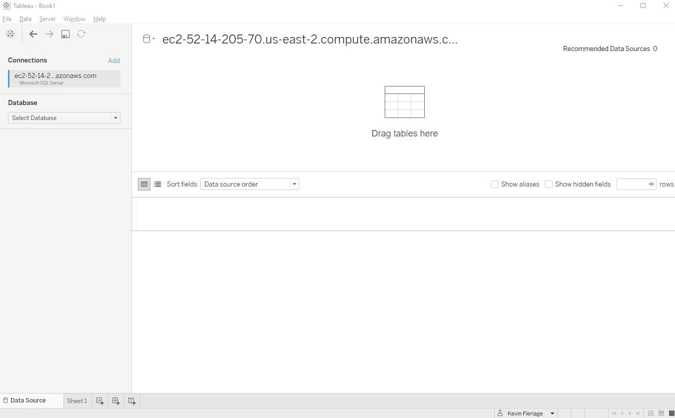
6. Update the Published Data Source
You must first create a local copy of the data source, swap it out for the published one, close the published data source, then make your changes or additions to the local data source. Finally, you must publish the local data source back to the server or online under the name that was originally published. When publishing the data source, make sure to select “Update workbook to use the published data source.”
7. Link for Optimal Mobile View and Thumbnail
Put a website URL in the External Link field by going to your viz on Tableau Public, Edit Details, and then your viz (this could be your website, your main Tableau Public page, or anything else). Then copy the URL by clicking the share button on the viz. Choose Original View if you are given the choice between Original View and Current View (Current View will not work properly). Just copy it on social media after that!
8. Display Every Value in Filters
The Category and Subcategory filters in the example gif are set to only display values that are pertinent. With the grey band selected, we have the Bookcases Subcategory. As expected, Bookcases are removed from the Subcategory filter when the Furniture Category is unchecked. We will once more see that Bookcases are missing if we attempt to Edit the Subcategory filter.
However, we can modify it to “All Values in Database” by clicking the tiny menu at the top right of the filter. When we do this, everything—including bookcases—now appears. This has helped me out a lot in a variety of situations.
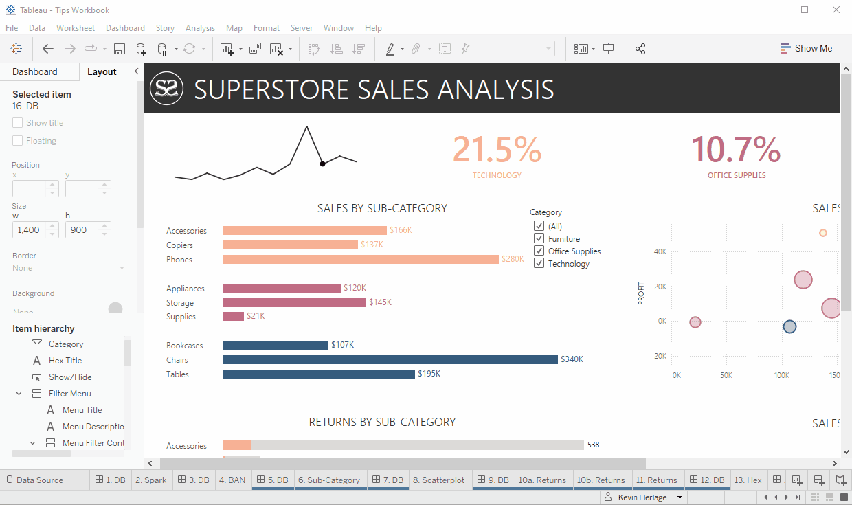
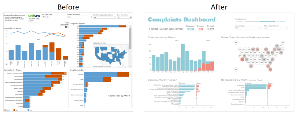
9. Remove Clutter
The trick is to eliminate as much as you can while making sure that your dashboard gives the end user the proper kind of insight. Since the “better” version can only be discovered over time, this process is frequently iterative. Check your most recent dashboard to see whether it contains too much information.
10. Collaborate and Iterate
The only approaches to identify the most accurate depiction of your data are through time and collaboration. All of the dashboards in our book underwent numerous revisions. We are continually making changes to them and adapting them to new business challenges today.
Conclusion
We believe that you enjoyed reading our blog and learned some helpful Tableau Tips & Tricks. Explore tableau more if you are really interested in this article. Enroll for Softlogic’s Tableau Training in Chennai with IBM Certification and understand more about other exciting Tableau features.