
In contrast to data sheets, Microsoft’s Power BI dashboards convey a story and highlight significant insights and patterns. Organizations can use dashboards to make decisions that are quicker, more accurate, and better. The good news is that anyone can design a Power BI dashboard; you don’t need to be an IT specialist.
Power BI allows users to create dashboards from a single report or a collection of reports by importing datasets or copying an existing dashboard. Dashboards are a single-page canvas as opposed to reports, which may feature numerous pages. These dashboards can be updated to display the most recent data, but they cannot be altered or filtered like reports.
What to think about before constructing a Power BI dashboard
You should consider what data you need to highlight before creating a dashboard. For instance, a company that prioritizes sales could want its dashboard to provide information on overall sales, top-selling products, sales over time, units sold per sale, sales by region, and top categories.
There is no one-size-fits-all solution or method; instead, each firm should customize its dashboard in accordance with its objectives, processes, and operational efficiency. A crucial point to remember is that dashboards are a Power BI service and are not offered by Power BI Desktop.
How to convert a report into a dashboard?
Reports are used to build dashboards. You can import your dataset as an Excel file if your reports aren’t in Power BI.
Importing an Excel dataset file
Start your browser and go to the Power BI service.
Choose My Workspace from the navigation pane, and then, at the very bottom of the menu, click Get Data.
Pick Get from the Files menu.
Locate your Excel document and select Connect.
The file will be imported automatically after choosing Import.
constructing a dashboard using a report
You can begin creating your dashboard now that you have your report on Power BI. Dashboards are made by pinning report-related tiles to a fresh dashboard. A full report can be pinned, as well as individual tiles from one or more reports.
How to build a dashboard?
- The Excel file report that will be included in the new dashboard should be chosen and opened.
- To open the report in the editing view, select More options (…) > Edit.
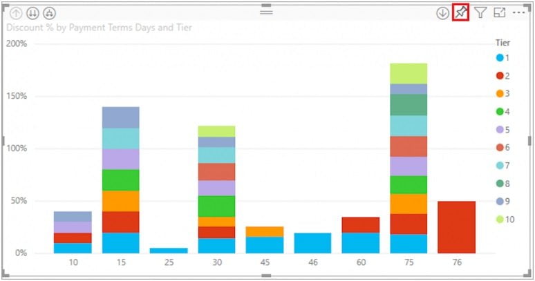
- To see the hidden choices, simply hover over a graphic. The tile can be added to the dashboard by selecting the Pin icon (Figure 1).
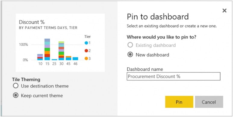
- Choose New Dashboard, then give it a name (Figure 2).
- Simply select Go To Dashboard.
Your new dashboard’s sole visualization ought to be the tile you pinned. Return to a report and repeat the process to pin more tiles. Keep in mind to click on Existing Dashboard and choose the name of your new dashboard from the drop-down box when adding more tiles.
How to construct a Power BI dashboard?
The tiles can be readily customized and updated once they have been added to a Power BI dashboard. Similar to resizing an image in a photo editor, resizing tiles requires dragging the bottom right corner of the tile. Additionally, titles’ positioning, appearance, and behavior can be changed.
How to alter the tile’s title?
- The More Options Menu can be discovered by selecting it from the title’s upper-right corner.
- To display the Tile Details window, select Edit Details.
- If necessary, modify the tile’s title and provide a subtitle.
- Users have the ability to modify the tile’s behavior in the same Tile Details box. Each tile’s default setting in Power BI directs users to the source report. However, by altering the default hyperlink in the Tile Details box, that behavior can be altered so that users are sent to a different dashboard or report.
How to modify a tile’s behavior?
- Pick Set Custom Link in the Tile Details window.
- From the dropdown menu, choose Link and the location to which you want the tile to route viewers.
- Choose Apply.
- Clear understanding is the foundation of dashboards. The use of graphs, charts, and other visualizations is crucial. Power BI offers a wide variety of visualizations that may be combined to produce a dashboard that enhances performance and analysis in addition to looking attractive.
How to modify a tile’s type of visualization
- A report with the visualization you want to update should be opened.
- To activate the visualization, select it. Keep in mind that the visualization should display handles and a boundary when it is selected.
- Locate and choose the new type of visualization from the Visualizations window.
- By selecting the Pin icon, you may add the Tile with the new visualization to your dashboard.
- Users can also add comments, copy the visual as a picture, open in focus mode, export, view insights, delete the title, and manage alerts using the More Options Menu.
How to use Power BI to set alerts
Power BI dashboards can benefit from alerts as a feature. Any user with access to the dashboard may view the alerts managed by each tile. To ensure a supply chain runs effectively, a logistic manager, for instance, may set up unique alerts for each employee spread across many locations. Users can set up notifications to be sent to emails in addition to Power BI’s Notification Center.
How to manage and set up alerts
- Choose More Options from the menu
- To manage alerts, click.
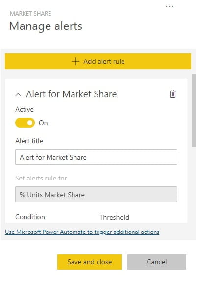
- To add an alert rule, click. Ensure that the Active switch is turned on (Figure 3).
- Set the alert’s threshold. The types of thresholds include Above, Below, and Specific.
- Set the alert’s recurrence interval.
- Save and exit.
A dashboard’s theme can also be modified. Three themes are available in Power BI: Light, Dark, or Color-blind friendly. Selecting the Custom theme option will allow you to customize the theme of a dashboard. Click Save after choosing the Dashboard theme from the edit drop-down menu to update the theme (Figure 4).
Dashboards must function effectively on all platforms, especially mobile ones, as endpoints become the new workplace. Users of Power BI can customize a dashboard for viewing on mobile devices.
The best way to modify a dashboard for mobile viewing
- After choosing View, select Mobile Layout.
- You will see a simulated mobile dashboard from Power BI. Tiles can be moved and changed in size, and information can be changed here.
- In accordance with the various devices used to view the dashboard, the mobile view can also be modified.
- For dashboards, Power BI offers a number of more sophisticated tools. Each firm can maximize its data by designing its own dashboard, which can be used for real-time data configuration, data classification, or sales tracking.